Part 6: Building a pie chart of Aave's loans in Vega
In the previous post, we built a stacked bar chart of Aave's loans in Vega. We found out trends for daily loan volume and a clear ranking of coins. But we couldn't figure out the relative size of coins. Let's build a pie chart to visualize that piece of information. For this, we'll use the pie chart example.
Drawing arcs
The first thing I need to do is set up a transform that generates the start and end angles of each coin. Based on the example, I could go with this. The signal lets the user choose the extent of the whole pie. The user could choose to show a full circle or a half circle for example.
{
  "type": "pie",
  "field": "coinSize",
  "startAngle": {"signal": "startAngle"},
  "endAngle": {"signal": "endAngle"}
}
To keep it simple, I'll remove the signal altogether. After removing the startAngle and endAngle attributes, it assumes that I want a full pie. Good.
{
  "type": "pie",
  "field": "coinSize"
}
Next I should render arcs. The tutorial uses this:
{
  "type": "arc",
  "from": {"data": "totalLoansByCoin"},
  "encode": {
    "enter": {
      "fill": {"scale": "color", "field": "coinSymbol"},
      "x": {"signal": "width / 2"},
      "y": {"signal": "height / 2"}
    },
    "update": {
      "startAngle": {"field": "startAngle"},
      "endAngle": {"field": "endAngle"},
      "padAngle": {"signal": "padAngle"},
      "innerRadius": {"signal": "innerRadius"},
      "outerRadius": {"signal": "width / 2"},
      "cornerRadius": {"signal": "cornerRadius"}
    }
  }
}
It uses the update property so that when the user changes one of the pie parameters with the sliders, the pie re-renders. I don't need re-renders, so I can move everything to enter. It turns out I also don't need padAngle, innerRadius nor cornerRadius since they have reasonable defaults. The minimal arc becomes this:
{
  "type": "arc",
  "from": {"data": "totalLoansByCoin"},
  "encode": {
    "enter": {
      "fill": {"scale": "color", "field": "coinSymbol"},
      "x": {"signal": "width / 2"},
      "y": {"signal": "height / 2"},
      "startAngle": {"field": "startAngle"},
      "endAngle": {"field": "endAngle"},
      "outerRadius": {"signal": "width / 2"}
    }
  }
}
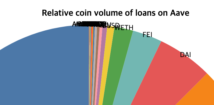
Here's how the pie looks:

Not bad. Now let's try and sort the coins by size. To do this, set sort to true in the arc transform.
{
  "type": "pie",
  "field": "coinSize",
  "sort": true
}
Note that this sorts the arcs, but the legend will still be unsorted unless you also sort the scale:
"scales": [
  {
    "name": "color",
    "type": "ordinal",
    "range": "category",
    "domain": {
      "data": "totalLoansByCoin",
      "field": "coinSymbol",
      "sort": {"order": "descending", "field": "coinSize", "op": "sum"}
    }
  }
],

To finish I'd like to show the percentage so that I don't have to guess.
Drawing labels
I have https://vega.github.io/vega/examples/radial-plot/ and https://vega.github.io/vega/examples/radar-chart/ to guide me. I'll need a text mark, and probably use a transform to compute percentages instead of absolute $ amounts.
Let's start with the text mark.
{
  "type": "text",
  "from": {"data": "totalLoansByCoin"},
  "encode": {
    "enter": {
      "x": {"field": {"group": "width"}, "mult": 0.5},
      "y": {"field": {"group": "height"}, "mult": 0.5},
      "radius": {"signal": "width / 2"},
      "theta": {"signal": "(datum.startAngle + datum.endAngle)/2"},
      "fill": {"value": "#000"},
      "align": {"value": "center"},
      "baseline": {"value": "middle"},
      "text": {"field": "coinSymbol"}
    }
  }
}
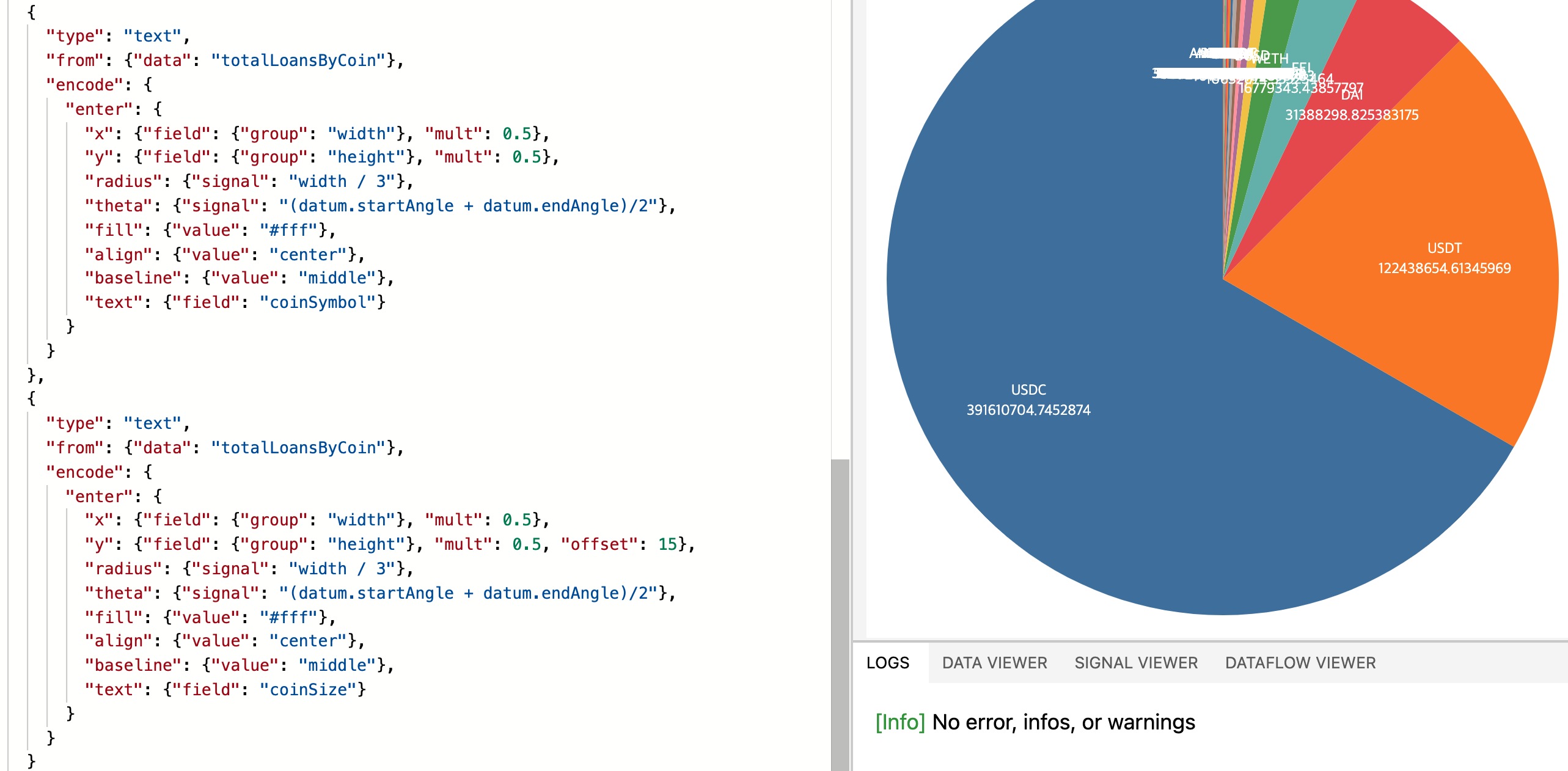
This gives the following labels:
It's something! Let's see if we can put this into the pie itself, and add the percentage.
By playing with the radius and y offset, I can display two pieces of information:
Next let's compute the coin sizes in percent. I thought I'd have to use some kind of transform but I couldn't find one that did it. Then I realized I could perhaps do it with a scale. And indeed it worked:
  "scales": [
    ...
    {
      "name": "percent",
      "type": "linear",
      "range": [0, 1],
      "domain": {"data": "totalLoansByCoin", "field": "coinSize"}
    }
  ],
  ...
  "marks": [
    ...
    {
      "type": "text",
      "from": {"data": "totalLoansByCoin"},
      "encode": {
        "enter": {
          ...
          "text": {"field": "coinSize", "scale": "percent"}
        }
      }
    }
  ]

Let's format it to an easy to read percentage. See the format doc...
So after some digging, I found a bunch of stuff:
- many blog posts mention the
templatefield in thetext mark. It turns out this does not exist anymore. - the budget forecast tutorial uses
signalto format strings and numbers. - the
text markaccepts an array in thetextfield as of Vega 5.7. Each string will be rendered on a different line. This makes my offset trick obsolete. The Playground threw an error when I tried it, though.
For example,"text": [{"signal": "format(.45, '.0%')"}] prints out "45%" fine, but "text": [{"signal": "format(.45, '.0%')"}, {"field": "coinSymbol"}] throws:
[Error] Expression parse error: (format(.45, '.0%'))datum["coinSymbol"]
It looks like a bad concatenation in the engine. Yet I'm on Vega 5.21.0. Fine, I'll just keep using the offset trick.
As for formatting the percentage:
"text": {"field": "coinSize", "scale": "percent"}renders0.312654003401405."text": {"signal": "datum.coinSize", "scale": "percent"}also renders0.312654003401405."text": {"signal": "format(datum.coinSize, '.0%')", "scale": "percent"}renders nothing."text": {"signal": "datum.coinSize + 5", "scale": "percent"}also renders0.3126540161691867. From this, we can deduce thatscaleis applied after processing thesignal. Now it makes sense why 3. failed to render anything.
Maybe we can do it in another way:
- use a transform for real this time.
- compute the max somewhere, and use this to compute the signal, and format it correctly.
- use a quantized scale. One drawback of this is that if a percentage is lower than 1%, it'll show up as 0%. Also, even if it works, it'll display the number as is. I won't be able to concatenate a "%" after it. So it wouldn't be very user friendly.
Quantized scale
Following the quantized scale doc, I wrote this scale:
{
  "name": "percent_rounded",
  "type": "quantize",
  "range": [0, 100],
  "domain": {"data": "totalLoansByCoin", "field": "coinSize"}
}
What happened is that it rendered 100 for the largest value, and 0 for everything else. Looks like I have to fix my range to actually be the allowed values. With "range": [0, 20, 40, 60, 100], I do indeed see those values in the chart:

The doc on point scales is quite bare. Even so, I tried this:
{
  "name": "percent_rounded",
  "type": "point",
  "range": {"step": 1},
  "domain": {"data": "totalLoansByCoin", "field": "coinSize"}
}
But it messed up the values.

I have no idea where those numbers come from. Let's give up on this approach.
Computing the percentage in the signal
Using the doc on signals, I whipped up this signal:
"signals": [
  {
    "name": "maxCoinSize",
    "update": "max(totalLoansByCoin.coinSize)"
  }
],
But got this error:
[Error] Unrecognized signal name: "totalLoansByCoin"
Looks like a signal can't access data.
A workaround would be to add a column to my table called maxCoinSize. This value would be duplicated on each row so that the text mark has access to it. Not great though. After searching a bit more, I found the extent transform.
Computes a [min, max] array for the field value and makes it accessible as a signal named extent.
That's exactly what I was looking for. So I added it to my data:
  "data": [
    {
      "name": "totalLoansByCoin",
      "transform": [
        {
          "type": "aggregate",
          "groupby": ["coinSymbol"],
          "fields": ["amountUsd"],
          "ops": ["sum"],
          "as": ["coinSize"]
        },
        {"type": "extent", "field": "coinSize", "signal": "extent"},
        {
          "type": "pie",
          "field": "coinSize",
          "sort": true
        }
      ],
      "url": "https://gist.githubusercontent.com/atn832/9ec2c5629c91b09102c4d79dd72d0335/raw/0fc8878eb755e4828fd81a5315e956b413bf4ce1/1000%2520latest%2520Aave%2520loans.json"
    }
  ],
and re-wrote the text mark:
"text": {
  "signal": "format(datum.coinSize / extent[1], '.0%')"
}
And got this:

So close! I had forgotten that the ratio should be done over sum(coinSizes), not max(coinSizes). So we'll have to use the aggregate transform to sum over coin sizes. Also I can't use aggregate in my current datasource, since it'll collapse all the rows into just one. I have to make another datasource. And then I can expose the total sum using the extent transform:
{
  "name": "totalLoans",
  "transform": [
    {
      "type": "aggregate",
      "fields": ["amountUsd"],
      "ops": ["sum"],
      "as": ["totalCoinSize"]
    },
    {"type": "extent", "field": "totalCoinSize", "signal": "totalCoinSizeExtent"}
  ],
  "url": "https://gist.githubusercontent.com/atn832/9ec2c5629c91b09102c4d79dd72d0335/raw/0fc8878eb755e4828fd81a5315e956b413bf4ce1/1000%2520latest%2520Aave%2520loans.json"
}

Perfect!!
What else... I'd like to put the same percentage next to each symbol in the legend.
Adding percentages to the legend
Looking at the doc on legends, there does not seem to be a way to do it. It makes sense, since the legend is generated off of a scale. It has no access to the data tables.
One can easily read the percentages of the 5 largest coins. Everything else is less than 2%. Now I realize that a better way to display this data would have simply been bars sorted from the largest to the smallest.
Here's the full code of the pie chart. Let's move on.