Part 7: Building a log-scaled histogram of Aave's loans in Vega
In the previous post, we built a pie chart to figure out the relative size of each coin. We figured precise percentages, and concluded that 5 coins were leading, and everything else accounted for less than 1% each. Let's stop looking at total volume for a moment and focus instead on the size of individual loans.
Preparing the data
Preparing bins
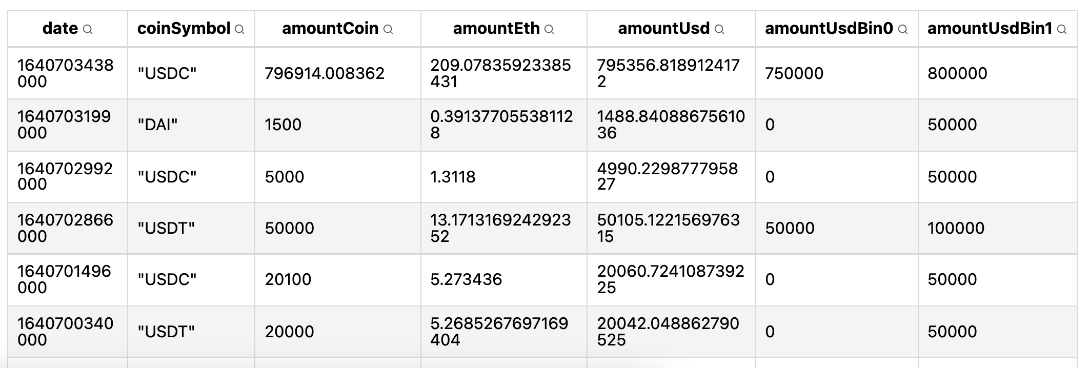
Using the bin transform doc, I started with this data definition:
"data": [
  {
    "name": "table",
    "format": {"parse": {"date": "date"}},
    "transform": [
      {
        "type": "bin",
        "extent": [0, 1000000],
        "field": "amountUsd",
        "as": ["amountUsdBin0", "amountUsdBin1"]
      }
    ],
    "url": "https://gist.githubusercontent.com/atn832/9ec2c5629c91b09102c4d79dd72d0335/raw/0fc8878eb755e4828fd81a5315e956b413bf4ce1/1000%2520latest%2520Aave%2520loans.json"
  }
],
What this does is assign a bin to each loan:
I had to hardcode the extend because it is a required field, and I haven't figured out how to make it compute the bounds automatically. Ideally, I'd just specify the number of bins, and it'd figure out the bounds for me.
The next step is to count how many loans are in each bin. For this we'll use an aggregate transform:
{
  "type": "aggregate",
  "ops": ["count"],
  "groupby": ["amountUsdBin0", "amountUsdBin1"],
  "as": ["bin0Count", "bin1Count"]
}
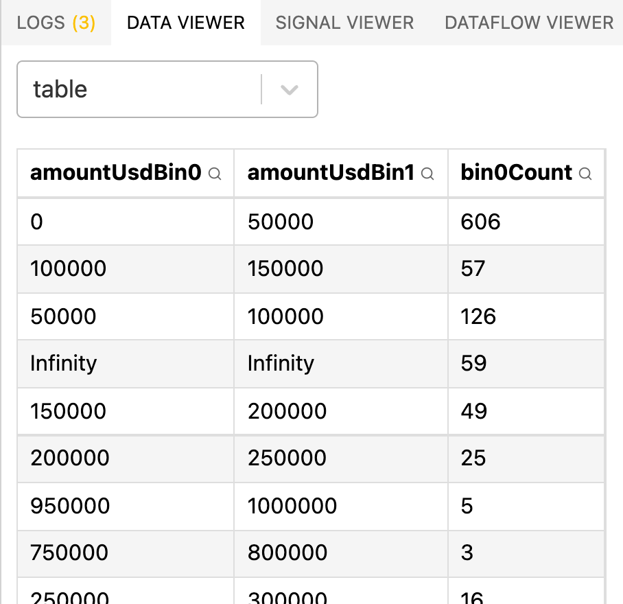
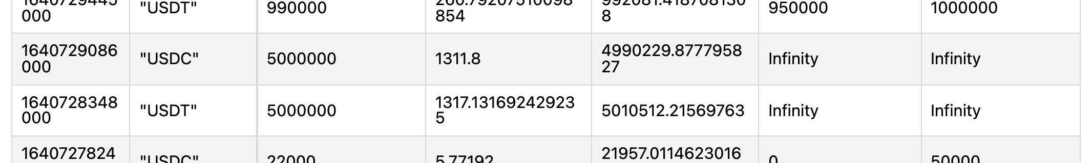
It looks like Infinity happens when the amountUsd is larger than the extent of my bins:
Computing bin ranges
Let's try using the extent transform. This transform computes the bounds of a field, then creates a signal that contains [min, max]. Then we can pass the signal directly to the bin transform's extent field:
"transform": [
  {"type": "extent", "field": "amountUsd", "signal": "amountUsdExtent"},
  {
    "type": "bin",
    "extent": {"signal": "amountUsdExtent"},
    "field": "amountUsd",
    "as": ["amountUsdBin0", "amountUsdBin1"]
  },
  {
    "type": "aggregate",
    "ops": ["count"],
    "groupby": ["amountUsdBin0", "amountUsdBin1"],
    "as": ["bin0Count", "bin1Count"]
  }
],
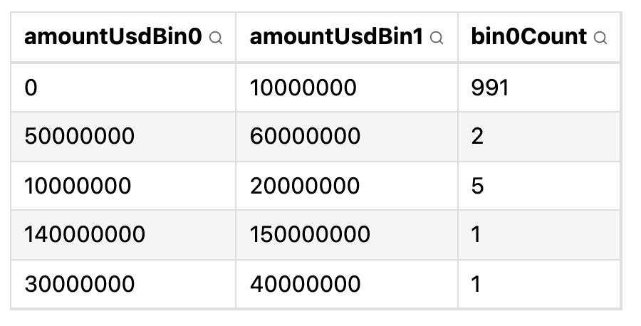
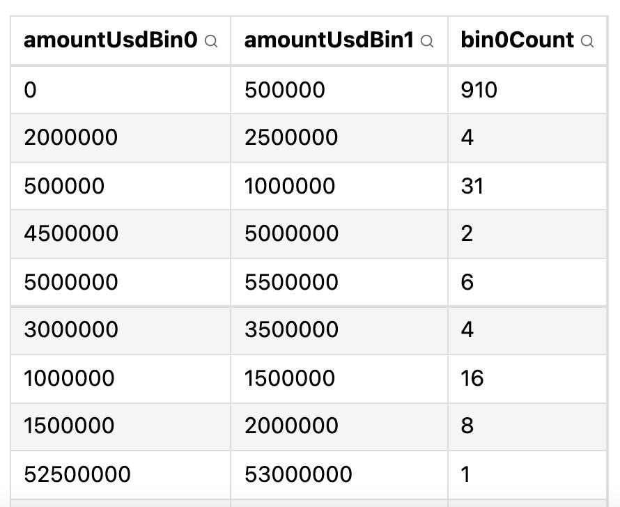
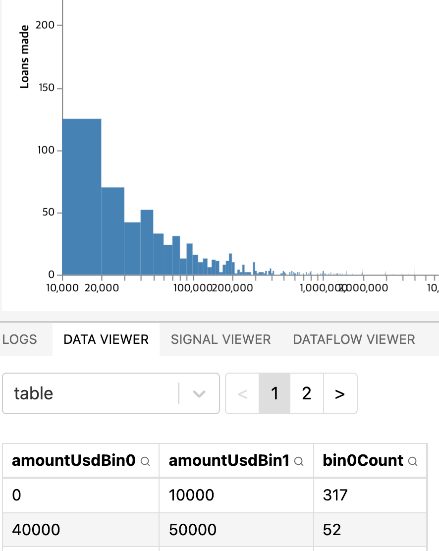
This fixes the Infinity issue. Now the issue is that the bins don't show meaningful information anymore. There's a bin that tells me that 99.1% of the loans are between 0 and $10m, and that there are a few outliers up to $150m.
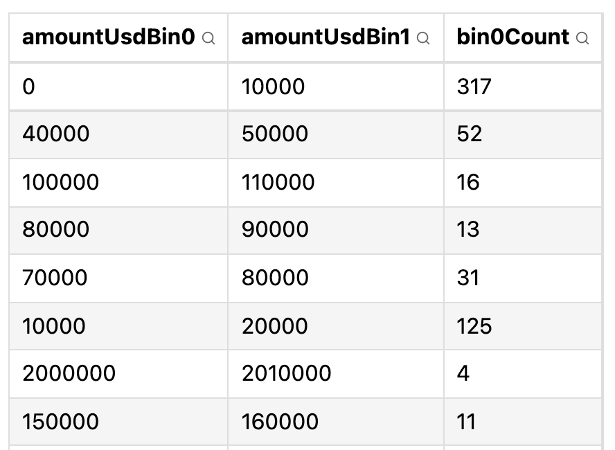
By setting "maxbins": 500, I get barely more information:
In my mind, I had expected a nice bell curve. However with bins of equal sizes, it won't happen. I could define the steps manually, and give a large interval to include large loans, and narrow intervals for smaller loans, since that's where most of the data points are grouped. But I can't think of an efficient way to define those steps. Or I could simply set one step, like "step": 10000,. With a step of $10k, I get somewhat meaningful numbers:
Let's plot this, then tweak the step to our liking.
Plotting the bars
"marks": [
  {
    "type": "rect",
    "from": {"data": "table"},
    "encode": {
      "enter": {
        "x": {"scale": "x", "field": "amountUsdBin0"},
        "x2": {"scale": "x", "field": "amountUsdBin1"},
        "y": {"scale": "y", "value": 0},
        "y2": {"scale": "y", "field": "bin0Count"},
        "fill": {"value": "steelblue"}
      }
    }
  }
]
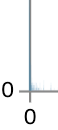
I defined the bars like this. Here's what I got:

Isn't it an empty chart, you might ask. Not quite! Look at the bottom left corner:
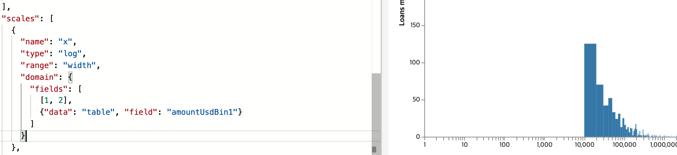
What can we do to make it more visible? I could use a log scale for X. Let's try that. The problem is, log scales can't contain zero, yet my scale currently does contain zero because of the first amountUsdBin0:
"scales": [
  {
    "name": "x",
    "type": "log",
    "range": "width",
    "domain": {
      "fields": [
        {"data": "table", "field": "amountUsdBin0"}
        {"data": "table", "field": "amountUsdBin1"}
      ]
    }
  },
If I simply remove amountUsdBin0, then my very first bar won't show up anymore:
Let's try to remove it and replace a hardcoded value of $1. The doc on multi-field data reference states the following about the fields property:
An array of basic data references indicating each data set and field value to include in the domain. In addition, array literals (e.g., [0, 100], ["a", "b", "c"]) may be included as elements of the fields array for inclusion in the domain determination.
So let's add an array litteral to it:
This fixes the X axis, but the bar for loans below $10000 is still not being rendered.
By the way, a more elegant way to write the scale domain is this:
"domain": {"signal": "amountUsdExtent"}
This does not throw an error when rendering the axis, because amountUsdExtent actually does not include zero. The Signal viewer shows:
amountUsdExtent: [0.0496280295585368,149932847.41595486]
How do I force the binning transform not to use zero? Or better yet, can I just force the first rectangle to avoid zero? Yes I can! By writing this formula to the x of the rect mark:
"x": {"scale": "x", "signal": "max(amountUsdExtent[0], datum.amountUsdBin0)"},

Adding interactivity
I really like the histogram example, which lets the user choose the bin step:
Let's add it to our chart. It'll be my first time using a signal as a user input.
"signals": [
  {
    "name": "binStep",
    "value": 10,
    "bind": {"input": "range", "min": 10, "max": 10000, "step": 10}
  }
],
Then in the bin transform, we reference it:
{
  "type": "bin",
  "extent": {"signal": "amountUsdExtent"},
  "step": {"signal": "binStep"},
  "field": "amountUsd",
  "as": ["amountUsdBin0", "amountUsdBin1"]
},
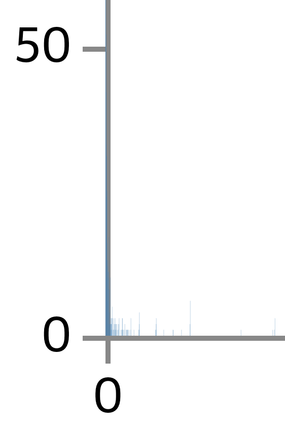
Here's what we get:
No matter the bin step, I can't find one that produces a chart that's easy to read.
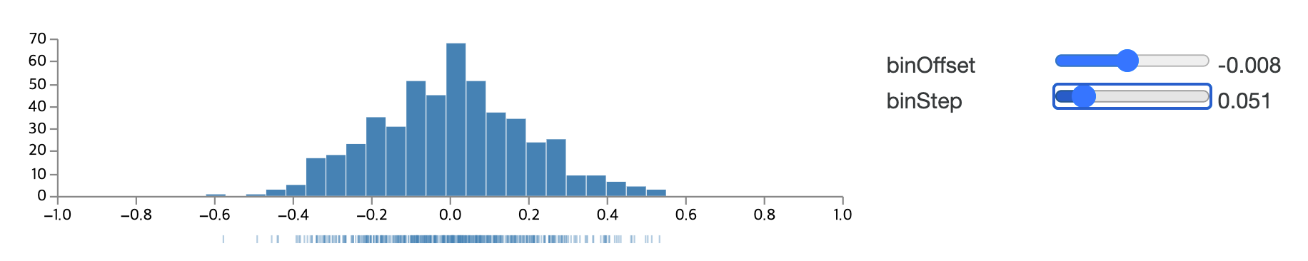
Or how about... using log steps??? It should show me interesting information, such as how many loans are between $1k and $10k, how many are between $10k and $100k, between $100k and $1m and so on. Please tell me there is a magical function in Vega that does this. The bin transform takes a steps property but that's not what I am looking for:
steps: Number[ ]. An array of allowable step sizes to choose from.
Another idea is to use probability densities. See the example. I don't quite understand it though.
What if I transform the amounts to log(amounts), then bin using a regular step, then exponentiate it again? Using a mix of the formula doc and the log-scaled histogram example, I finally got something that's acceptable.
Now I can confidently say that most loans are between $2k and $200k, with a few rare outliers as low as $2 and as high as slightly over $100m.