Part 4: Building a line chart of Aave's loans in Vega
In the previous post, we exported Aave's loan data to a readable JSON of rows. Now let's display the time series in a line chart.
Date scales
What if I have events that happen throughout the day, but I'm only interested in the total sum of values per day, week or month? My data looks like this:
[
  {
    "date": "2021-12-26T00:44:24.000Z",
    "coinSymbol": "USDT",
    "amountCoin": 150000,
    "amountEth": 39.12118760339925,
    "amountUsd": 149232.07344380283
  },
  {
    "date": "2021-12-29T00:06:20.000Z",
    "coinSymbol": "USDT",
    "amountCoin": 2000000,
    "amountEth": 521.6158347119899,
    "amountUsd": 19760.979250704
  },
  {
    "date": "2021-12-28T23:12:38.000Z",
    "coinSymbol": "USDC",
    "amountCoin": 100000,
    "amountEth": 26.236,
    "amountUsd": 10080.10796000001
  },
  {
    "date": "2021-12-30T23:10:55.000Z",
    "coinSymbol": "USDC",
    "amountCoin": 200000,
    "amountEth": 52.472,
    "amountUsd": 20160.21592000002
  },
  {
    "date": "2021-12-28T21:02:59.000Z",
    "coinSymbol": "DAI",
    "amountCoin": 250,
    "amountEth": 0.065229509230188,
    "amountUsd": 248.82513820456745
  },
  {
    "date": "2021-12-29T23:02:59.000Z",
    "coinSymbol": "DAI",
    "amountCoin": 250,
    "amountEth": 0.065229509230188,
    "amountUsd": 248.82513820456745
  }
]
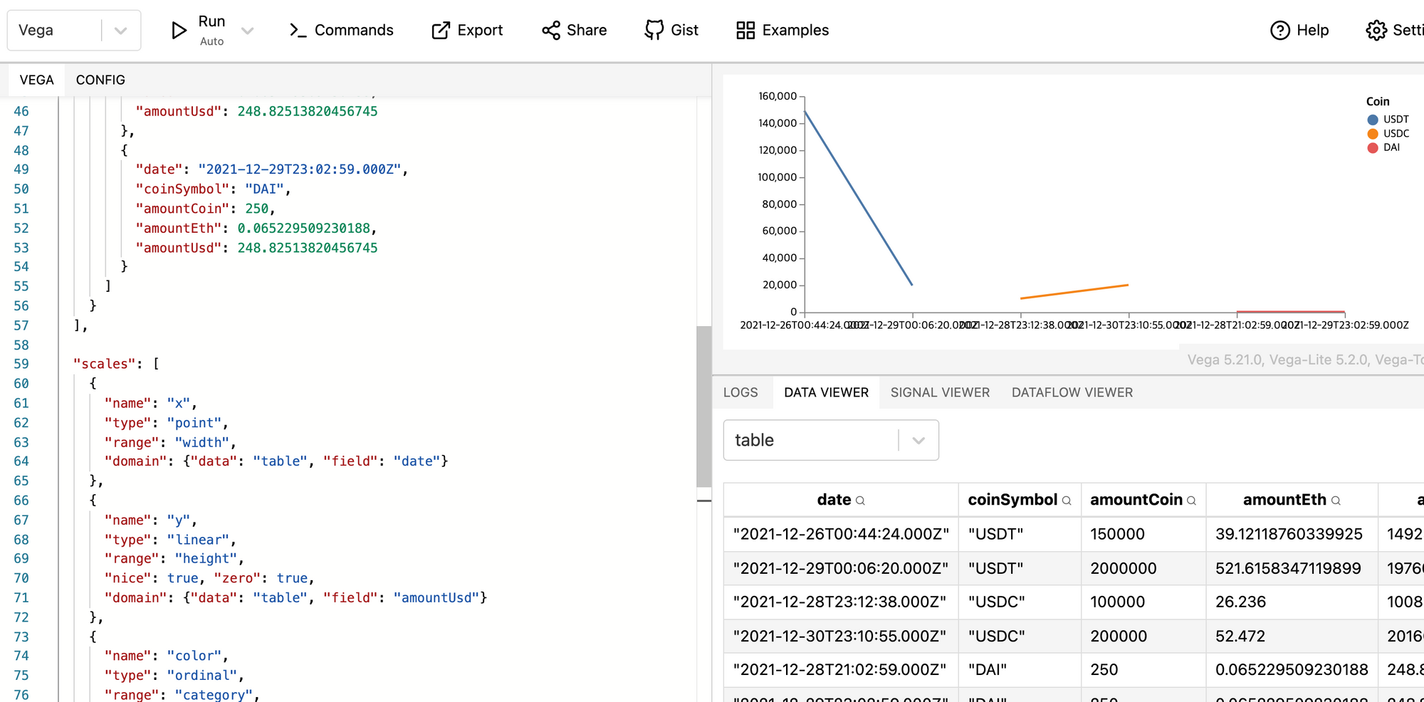
Point scale
One thing I had not noticed is that Vega parsed my date field as is, that is to say as a String. You can see it in the Data view in the bottom right.
Time scale
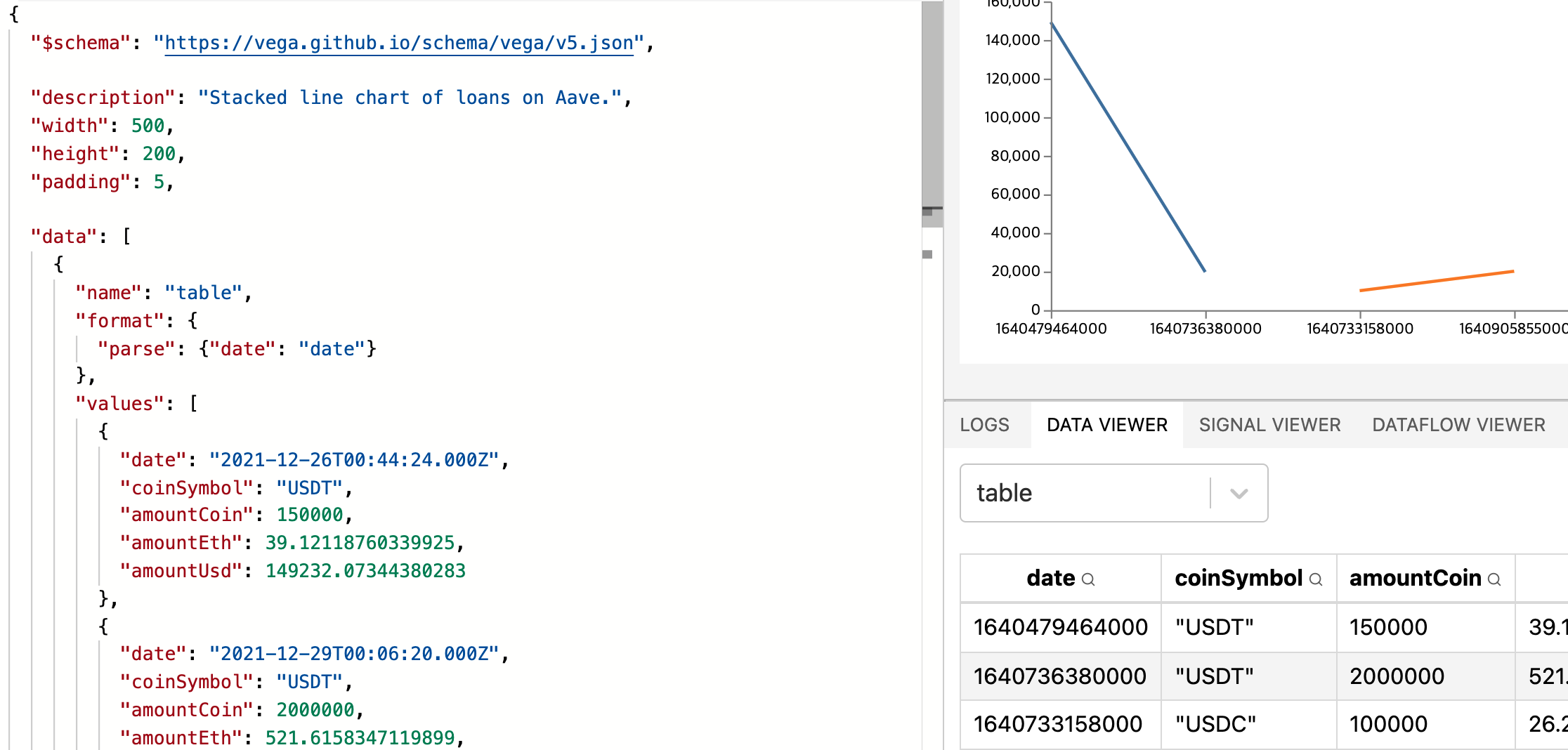
When I first switched the scale type to "time", it threw an error about my scale being unbound, going from [-Infinity; Infinity]. Thanks to this post, I found out that was because I wasn't passing actual Date objects to Vega.
To make Vega interpret my raw date strings as Dates, you have to tell Vega how to parse the date field. See the data reference and the format reference.
  "data": [
    {
      "name": "table",
      "format": {
        "parse": {"date": "date"}
      },
      "values": [
        {
          "date": "2021-12-26T00:44:24.000Z",
          "coinSymbol": "USDT",
          "amountCoin": 150000,
          "amountEth": 39.12118760339925,
          "amountUsd": 149232.07344380283
        },
        ...
      ]
    }
  ]
Once it is properly parsed, the Data Viewer shows the Date as a number.
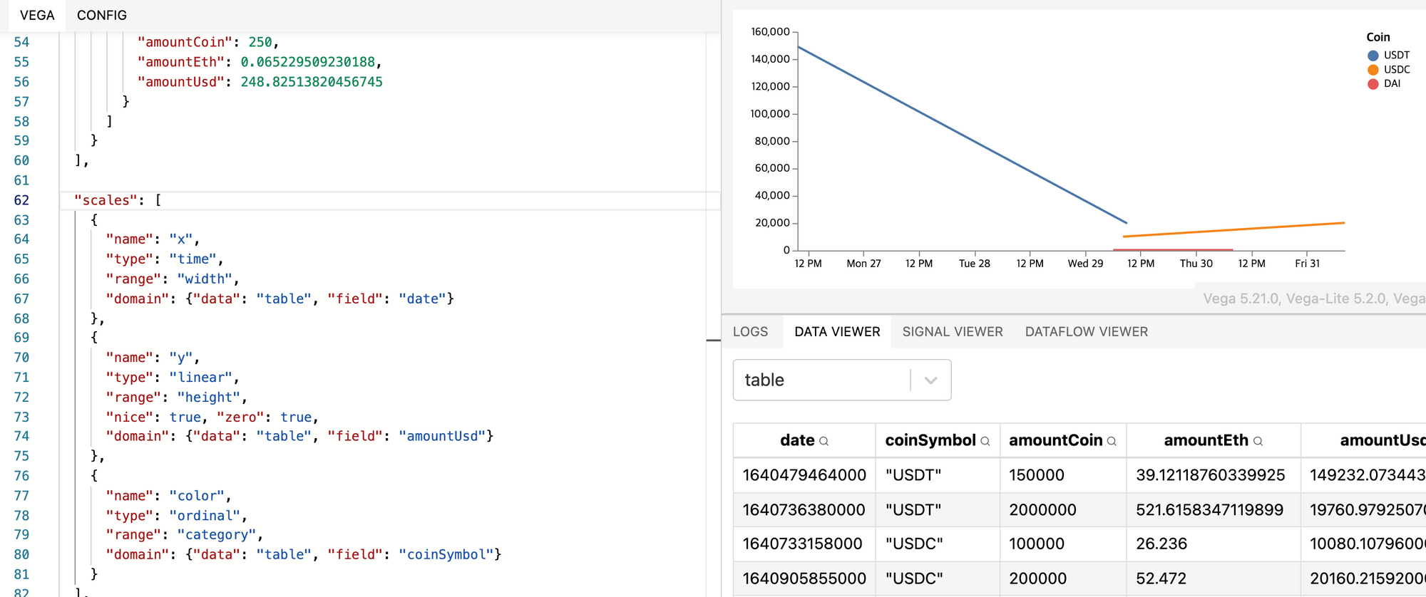
Now I can switch to a better scale than point. After reading the doc on time scale, I switched to a time scale, which improved the tick marks on the time axis:
  "scales": [
    {
      "name": "x",
      "type": "time",
      "range": "width",
      "domain": {"data": "table", "field": "date"}
    },
    ...
  ]
Aggregating points
In order to get a meaningful view of the data, we need to aggregate data points by days or weeks or months, depending on how high-level of a view we want.
TypeScript or Vega?
We can do it in TypeScript when preparing the JSON, or do it directly in Vega. We can also do something in-between like "floor" the keys in TypeScript, then aggregate in Vega. To summarize, here are the three levels:
- Full React: "floor" keys in TypeScript, then aggregate them by key. Produce the JSON for Vega to consume.
- Half and Half: "floor" keys in React, aggregate in Vega.
- Full Vega: "floor" keys with Vega transform expressions, aggregate in Vega.
Initially, I thought the effort to go either way would be similar and that the pros and cons of each method were somewhat equal. It turns out it's much more efficient to go the Full Vega route because Vega provides many useful high-level functions for graph-related work. For example, aggregating data points by day, week, etc. is a breeze. It'd be a total waste of time to code this ourselves.
Flooring dates
I naively thought that I could modify the scale to perhaps anchor my points to "floored" days. But tweaking the scale will only modify how the points linearly stretch along the width of the graph. For example I could make the axis show nice tick marks from Dec 26 midnight to Dec 31 midnight instead of Dec 26 at 12 pm to Dec 30 at 11 am (I am making up hours here).
To aggregate the points, I have to transform the data itself. There are a bunch of transformations readily available at the transform reference. Those that might apply to me are:
- aggregate - Group and summarize a data stream.
- bin - Discretize numeric values into uniform bins.
- formula - Extend data objects with derived fields using a formula expression.
- joinaggregate - Extend data objects with calculated aggregate values.
- timeunit - Discretize date-time values into time unit bins. Available for version ≥ 5.8
The one that applies the most is timeunit.
When I add the transform that "floors" to the current day, it adds two columns to my table: unit0, which "floors" the date, and unit1, which "ceils" the date. Notice how I used the units "year" to keep the year in the value, and "dayofyear". If I had used "day", it'd have evaluated to the day of the month, in which case it'd have transformed my dates into Jan of 2021.
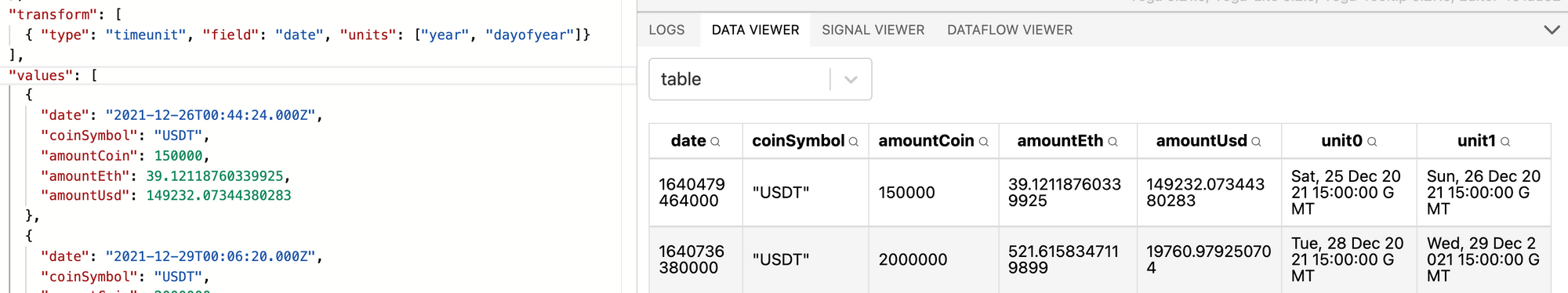
To make the transformed value more readable, I renamed it to date0 and date1. Here's the final definition of my transformation:
"transform": [
  {
    "type": "timeunit",
    "field": "date",
    "units": ["year", "dayofyear"],
    "as": [
      "date0",
      "date1"
    ]
  }
],


Notice also how the left line goes beyond the bonds. That's because in my axis, I forgot to use the transformed dates instead of the raw dates. The earliest raw date is Dec 2021, 26 at 00:44 but the earliest transformed date is Sat, 25 Dec 2021 15:00:00 GMT.
Aggregating points
Using the aggregate reference, here's my first attempt:
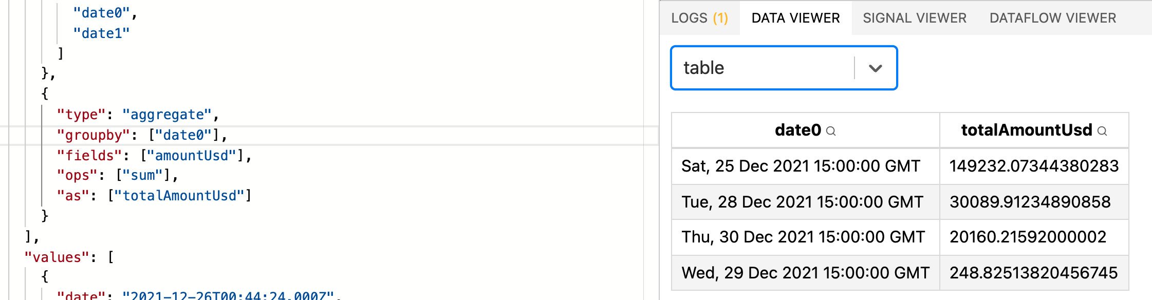
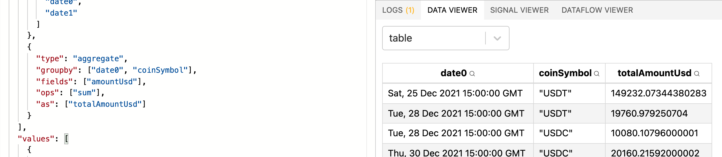
It removed all of the original fields. If I add coinSymbol to groupby, I get something closer to what I want.
Let's add another data point for USDT on Dec 25 and check that totalAmount is computed correctly.
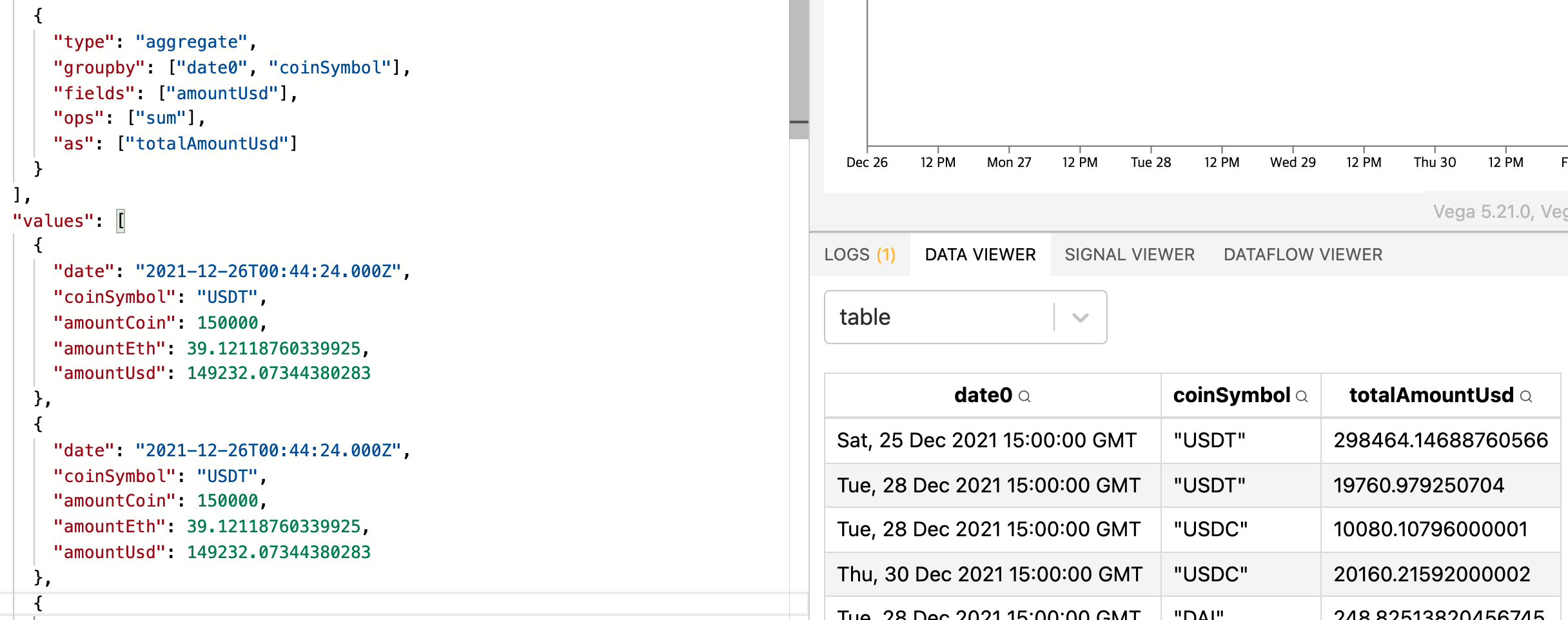
Yep, it works.
To finish, I simply need to adjust the scale to use the new totalAmountUsd instead of the defunct amountUsd column, and to draw my line using totalAmountUsd for the y value.

Using actual data
And here's the chart of the latest 1000 loans:

USDC loans dwarf everything. Let's see what it looks like in logarithmic scale.

See the code in the Vega playground.
Now we can even see tiny transactions as low as 10 dollars. Awesome! And it also exposes a bug in our graph: what if in that time frame, there is only one transaction of a certain unit? Then the line won't show up. Also what happens if there are transactions on let's say Dec 23, then nothing until Dec 26? What does it mean to have a line connect the two points? It's quite misleading. The fix would be to either:
- turn the line chart into a stacked bar chart. If on a certain day, there is no loan for a certain currency, the rectangle just won't show up.
- add synthetic data, namely zero's for days when no loan was made for a given currency.
The second approach seems much harder to implement. If I had to do it, it would be with a lookup transform (see reference). But then I need to make one intermediate table to perform the lookups from.